Fluke*
Html5/CSS3/jQuery template by pezflash
- Created: 27/2/2016
- Current version: v.1.0 - 27/2/2016
- Author: pezflash
- https://themeforest.net/user/pezflash
Thank you for purchasing this file. If you have any questions that are beyond the scope of this help file, please contact me through my Envato profile page form.
INTRODUCTION
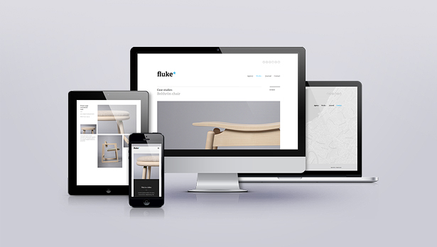
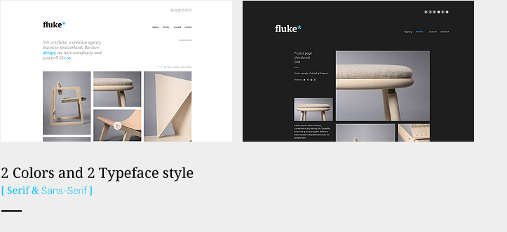
Fluke* is an original template for showcasing creative business, easily customizable with 15 layouts, 34 modules and 21 plugins integrated. The template comes with 2 styles (Serif and Sans-serif), and both with light and dark versions. Also it includes an useful ONE PAGE SCROLL SITE, on both versions. It has been deeply tested in several platforms, and it's fully responsive on mobile and tablet devices..
15 PRE-BUILT LAYOUTS
Unlimited possibilities due to its modular system:- Home page with fullscreen gallery slideshow
- Company - About us - Team page
- Case studies
- Masonry Portfolio
- Grid Portfolio
- Project page
- Project page (alternate)
- Video Project page
- Fullscreen project showcase
- Unordered grid
- Contact Location Page with Fullscreen Google Maps API integrated
- Contact Location Page with Map & Form
- Blog Page with Instagram Feed
- Blog - Article page with functional commenting system (DISQUS)
- One Page Site Version
2 BUILT-IN STYLES BUT UNLIMITED POSSIBLITIES
The template includes 2 useful styles, SERIF and SANS-SERIF, to improve flexibility. Both versions includes the LIGHT and DARK versions. Worth to mention is the ONE PAGE SCROLL version you will find for each of the styles.
HTML STRUCTURE AND CUSTOM MODULES
This template is coded in an intuitive format to make easier the customization. All the code is commented and clean formatted. The best way to get a full idea of the html structure is looking at the provided samples.
The global html structure refers as follows:
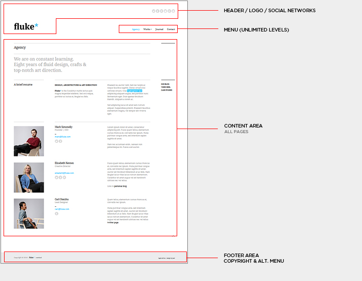
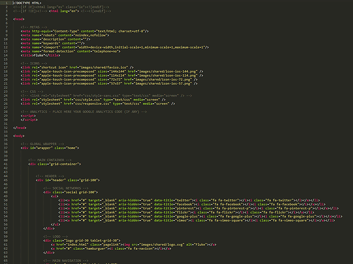
First of all, on < head > tag, the Metas, Platform icons and Main CSS (desktop and responsive) for each page are linked. There is also a predefined tag so you can place there your Analytics code. On < body > tag you will find all the contents of the site, on each page the different modules are placed inside the GRID (built with Unsemantic framework). At the end of the body you will find the required JS files, and at the end of the list, the global functions located at js/scripts.js file. Each page contents the required JS Calls, loaded within < script > tag, at the end of the HTML code. All entries are labeled and commented, so try to follow slowly the provided samples to customize your elements.
The template uses Google API fonts, so changing the whole font of the template is easier. Check the CSS chapter to see how
to change the font.
[TIP 1]: Take advantage of the awesome Unsemantic Grid
Fluke* uses a flexible responsive GRID, based on Unsematnic Framework. Just consider you have full control of columns for all platforms, desktop, tablet and devices, with the possiblity to have different layouts (or even contents!) on the different devices. There are also 2 breakpoints for desktop screens, which fluid smoothly from 960 to 1200 grid systems. The best way to get used to it is following the provided samples.
For more info and fonts check the following URL:
https://unsemantic.com/
[TIP 2] Global Menu
The DIV with class nav displays the menu element. It uses the powerful superfish jquery plugin in horizontal format, with unlimited levels. The current version in the preview shows an example of third level menu. Normally, you shouldn't need much more levels for a portfolio site. The html structure is pretty straight forward, as you will see, only note that to mark an item inside the menu as "active", that's is, marking it with selected color, you will need to add the class="current" to the parent < li > tag.
For more info about superfish plugin, check the following url:
https://users.tpg.com.au/j_birch/plugins/superfish/
Please, note that the plugin has been fully customized for Fluke*, in case you decide to update or modify it.
[TIP 3] How to switch between versions
On 01_Templates folder you will find both the light and dark versions of Fluke*. Inside both of them, you can easily change from Serif to Sans-serif version just modifying the main CSS file (style.css for Serif default version, styles-sans.css for Sans-Serif). Just place on of the following (not both!):
	// THIS IS THE SANS SERIF VERSION


	// THIS IS THE SERIF VERSION (DEFAULT)
Note that if you want to change the whole font scheme, you will need to do it inside the CSS file. Refer to CSS Chapter for more info.
01. [PORTFOLIO MASONRY]
This is the module used in the default homepage on provided samples. It's based on Isotope plugin, and allows to filter and sort your galleries. Follow the provided sample (both on home and masonry portfolio pages) to see how it works. Normally you will open the big image on provided lightbox, but you can change this behaviour with anything you need, direct or external urls, or even just plain images displayed on the masonry grid, wihtout any further event.
			projects.isotope({
				itemSelector: 'li',
				transitionDuration: '0.4s',
				masonry: {
					gutter: 20
				},
				hiddenStyle: {
					opacity: 0, transform: 'scale(0)'
				},
				visibleStyle: {
					opacity: 1, transform: 'scale(1)'
				}
			});
For more info about Isotope plugin, check the following url:
https://isotope.metafizzy.co/
02. [CASE STUDY]
Case Studies is basically a layout module, without any further JS functionality. You can use it to make a full case studies page, like the sample provided, of to use a simple element with the title+subtitle+hover event. This module is used, for example, on the "More works" section at the end of several portfolio pages. Play with the different configurations (all through CSS classes asigned to html element), like right-aligned, center-aligned (for positioning the title & subtitle) of smaller, fixed... (for sizing and visibility). Again, check the provided demos to learn the different posibilities.
03. [PROJECT GRID & PROJECT UNORDERED GRID]
These are again a layout modules, which can be configured using the grid and the custom classes that are asigned to the html elements. With almost no effort you can achieve beautiful grid layouts, mixing images and texts, an using different columns widths. You can mix the project grid module with case study to make a full width element between the grid. Play with different buttons and contents, as in the provided sample.
04. [SLIDER & CAROUSEL]
The slider module is used on several places of the template, basically on slider galleries on portfolios, but also to showcase the client module, which uses the same functionality. The module uses the awesome LightSlider JS plugin, which has a wide range of options and possibilities. The slider is used in a minimal style to match the Fluke Design, but you can take full control of the slider using the custom built options. The JS code is commented for each options, but i recommend you to check the plugin demo site to see how far you can go using it.
The Client module also takes advantage of the flexible "responsive" options of the plugin, which makes possible to display different number of items on the slider depending on the device screen width.
For more info about LightSlider plugin, check the following url:
https://sachinchoolur.github.io/lightslider/
			$('.slider ul').lightSlider({
				item: 1,													// NUMBER OF SLIDES PER PAGE
				slideMargin: 0,												// SLIDE MARGIN - in pixels
				mode: 'slide',												// MODE: 'slide' OR 'fade'
				cssEasing: 'cubic-bezier(0.860, 0.000, 0.070, 1.000)',		// EASE EFFECT. CREATE YOUR OWN HERE: https://cubic-bezier.com
				speed: 700,													// ANIMATION SPEED - in miliseconds
				auto: false,												// AUTOPLAY: true OR false
				loop: false,												// LOOP ON END: true OR false
				pause: 2000,												// PAUSE DELAY ON AUTOPLAY - in miliseconds
				keyPress: true,												// ALLOW KEYBOARD ARROWS NAVIGATION: true OR false
				controls: false,											// NAVIGATION ARROWS: true OR false
				prevHtml: '',						// CUSTOM PREV NAV ARROW
				nextHtml: '',						// CUSTOM NEXT NAV ARROW
				pager: true,												// PAGINATION DOTS: true OR false
				currentPagerPosition: 'middle',								// PAGINATION POSITION - 'left', 'middle', 'right'
				vertical: false,											// VERTICAL MODE: true OR false
				verticalHeight: 500,										// HEIGHT ON VERTICAL MODE
				vThumbWidth: 200,											// WIDTH OF THUMBNAIL ON VERTICAL MODE
				gallery: false,												// GALLERY MODE: true OR false
				galleryMargin: 5,											// IMG MARGIN ON GALLERY MODE
				thumbMargin: 5,												// THUMBS MARGIN ON GALLERY MODE
				enableTouch: true,											// ENABLES TOUCH SUPPORT
				enableDrag: true,											// ENABLES DRAG SUPPORT
				responsive: [												// RESPONSIVE BREAKPOINTS

				]
			});
05. [CLIENTS MODULE]
See [04 - SLIDER]
06. [ONE-ROW SHOWCASE]
These is a layout module, which can be configured using the grid and the custom classes that are asigned to the html elements. Is a simple module to make visual work showcases using only one fullwidth row.
07. [IMAGE WITH ICON REVEAL]
A useful module to place images with centered icons and a subtle hover effect. Normally used for Video link, you can place any icon from FontAwesome Font gallery to enhance any image link (ie. a photo with a magnifier icon to zoom in). Need not other configuration than HTML markup. Follow the samples provided along the template.
08. [TEAM MODULE]
A styled 3 column module to display the member info, without any further JS functionality. Photo, Name/position/email/social-networks and Description paragraph. Turns smoothly on several rows on mobile view. It can be used also to showcase small projects. Be creative and turn the image a slider, or modifying the grid widths to achieve more complex layout. Check the Social networks module to complement this one.
09. [SOCIAL NETWORKS]
This module is used in several places across the template, the main place on the header, to link with your own social networks, using the included FontAwesome icon fontface. It's complemented with a useful toolTip (Tipper jQuery plugin) element, which will take the "data-title" attribute of the link to render the title.
Note: Although the Share module uses part of this Social module, consider that the funcionality is completely different. Basic Social module is used to link your own networks; meanwhile, the Share module includes the functionality to actually share the current page where is placed on the provided networks.
		// THIS CODE IS COMMON FOR ALL HTMLS AND IT'S LOCATED ON GLOBAL js/scripts.js FILE
		var tipperMargin = 15;
		$('.social').each(function() {
			if ($(this).hasClass('bigger')) tipperMargin = 20;
			$(this).find('a').tipper({
				direction: 'top',
				margin: tipperMargin
			});
		});
For more info about Tipper plugin, check the following url:https://classic.formstone.it/components/tipper
10. [SUBLINKS]
Sublinks is an unordered list of links with a tiny icon reveal on hover. You can customize the icon up to your needs. It's useful for concrete submenus to place inside content (check the ones on right column on about page, for example). You can create a list of links, each one with its own different icon. Alternatively, if you only need a link with that icon reveal effect, check the "icon-reveal" class used, for example, on email links on the same about page.
11. [QUOTE]
A standard quote module, to use in any place of your site, without any further JS functionality. It includes quote and author element, displayed in an elegant way. Check a sample on "Case studies" page or in the blog-article page, integrated with the post paragraphs.
12. [CALL TO ACTION]
A styled fullwidth module, without any further JS functionality. Customize the title, subtitle and button link. By default, it gets the background color from global accent color. You can change it editing the CSS.
13. [PARALLAX BLOCK]
The parallax module is a visual element to display a background image with a parallax scrolling effect. It can be used on any width size within the grid. Also, check the fullwidth portfolio sample, you can achieve great page effects using different parallax modules. The sample includes a title inside the block, but is completely optional. The module has some parameters (the ref to image included) that must be controlled directly on the HTML markup:
				Sample of parallax
 image block
		$('.parallax-block').parallax({
			mobile: mobile
		});
[TIP] Note that the image must be larger in height than the data-height attribute value.
14. [ACCORDION]
The accordion module uses the Collapse jQuery plugin, which is a powerful a flexible way to display collapsing vertical contents. It's fully integrated in responsive, and normally you wouldn't need to change the JS options provided in the demo.
			$('.accordion').collapse({
				accordion: true,
				open: function() {
					this.addClass("open");
					this.css({ height: this.children().outerHeight() });
				},
				close: function() {
					this.css({ height: "0px" });
					this.removeClass("open");
				}
			});
[TIP] If you want to remove the PLUS-MINUS icon on the left, to it directly on the CSS, adding a "display: none;" to the :before pseudoselector.
For more info about Collapse plugin, check the following url:
https://webcloud.se/jQuery-Collapse
15. [TABS]
The Tabs module uses a felixble plugin (EasyTabs) that can be easily customized through the built-in parameters. The provided samples includes comments to guide you in the customization process. On mobile devices, it downgrades smoothly to display only the icons on the tabs.
			$('.tabs').easytabs({
				animate: true,												// ANIMATION: true OR false
				animationSpeed: 400,										// ANIMATION SPEED - in miliseconds
				cycle: false,												// AUTOPLAY BETWEEN TABS: false OR milliseconds
				collapsible: false,											// ACTIVE TAB COLLAPSE OR NOT WHILE CLICKING: true OR false
				transitionIn: 'fadeIn',										// IN TRANSITION EFFECT: 'fadeIn' OR 'slideDown'
				transitionOut: 'fadeOut',									// OUT TRANSITION EFFECT: 'fadeOut' OR 'slideUp'
				updateHash: false											// USE URL HASH: true OR false
			});
For more info about EasyTabs plugin, check the following url:
https://os.alfajango.com/easytabs/
[TIP] There are more plugin options available. To check the full list, click on this link: https://os.alfajango.com/easytabs/#available-options
17. [PROGRESS BAR]
A tiny module to display progress bar in a easy way. Just place your desired percent on the HTML markup, and the module will do the rest.
[TIP] Check this module integrated in the next one, interactive-boxes.
18. [INTERACTIVE BOXES]
A complete CSS module, to showcase services or other tiny content you may need. It includes the progress bar module and a link button that is displayed smoothly on hover. It does not require any further JS interaction.
19. [FLIPCARD]
Same as the previous module, it's built completely in CSS, although it can be run externally with the JS code displayed below. It has 2 animations, horizontal or vertical, that are setup directly with a css class. It has a fixed size, so if you need other that square version, you will need to edit width and height values on CSS. Note that the hover event will switch to click event on touch devices.
		$('.flipcard').addClass('flip');
		$('.flipcard').removeClass('flip');
20. [KENBURNS SLIDESHOW]
This is a useful slider effect that can be used in fullwidth (check the Project alternate page) or for tiny image galleries, like in the modules-samples page demo. If you will have several kenburns galleries on the same page, please refer to them with independent IDs to avoid conflicts. Play with the available options to match your needs. The animation is built with CSS transitions, so it will run smooth even on mobile devices. It allows captions for images, and navigation system (arrow + pagination).
		$('.kenburns-slideshow > div').smoothSlides({
			effectDuration: 6000,										// DURATION OF EFFECT
			transitionDuration: 800,									// TRANSITION DURATION
			effect: 'zoomOut,zoomIn',									// EFFECT TYPE, IN RANDOM - 'crossFade' 'zoomOut' zoomIn' 'panUp' 'panDown' 'panLeft' 'panRight'
			navigation: 'false',										// NAVIGATION ARROW  - 'true'  'false'
			pagination: 'false',										// PAGINATION DOTS  - 'true'  'false'
			captions: 'false',											// SHOW CAPTIONS (use 'alt' attribute on each image)  - 'true'  'false'
			matchImageSize: 'false'										// ALLOW IMAGE SCALING OVER 100%  - 'true'  'false'
		});
It uses the SmoothSlides plugin. For more info about it, check the following url:
https://kthornbloom.github.io/Smoothslides/
21. [GOOGLE MAP]
The Google Map module uses Gmap plugin to connect and enhance the Google Maps API. It can be used for a grid module or fullwidth as in the full-width Contact page sample. The global styles must be setup in js/scripts.js. By default, its styled with a subtle monochrome color scheme. Edit your address using the latitude and longitude values in the JS, and don't forget to change the marker url and data. To improve flexibility, the map height can be setup in the html element, modifying the data-height attribute.
			// GOOGLE MAPS WITH GMAPS
			// SET LATITUDE AND LONGITUDE FOR MARKER AND CENTERING
			var mapDiv = $('#gmap'),
				lat = 46.2035611,
				lng = 6.1440617;

			// SET MAP HEIGHT USING DIV DATA ATTRIB
			mapDiv.height(mapDiv.attr('data-height'));

			// SET MAP OPTIONS
			map = new GMaps({
				el: '#gmap',
				lat: lat,
				lng: lng,
				zoom: 16,
				zoomControl: true,
				zoomControlOpt: {
					style : 'SMALL',
					position: 'TOP_LEFT'
				},
				panControl: false,
				mapTypeControl: false,
				overviewMapControl: false,
				streetViewControl : true,
			});

			// ADD MARKER
			map.addMarker({
				lat: lat,
				lng: lng,
				title: 'Geneve Headquarters',
				icon: 'images/contact/marker.png',
				click: function(e){
					window.open('https://bit.ly/1QMRXTv','_blank');
				}
			});

			// ADD MAP STYLES (GLOBAL STYLES DEFINED ON js/scripts.js > 'mapStyles')
			map.addStyle({
				styles: mapStyles,
				mapTypeId: "map_style"
			});

			map.setStyle("map_style");
[TIP] - To create map styles, you can used the awesome tool on https://snazzymaps.com
It uses the Gmaps plugin. For more info about it, check the following url:
https://hpneo.github.io/gmaps/
For more info and documentation about Google Maps API:
https://developers.google.com/maps/
22. [OVER BOX]
A simple CSS module to place a centered text box over an image element, at the bottom. You can see a sample of this module on works-project-alt.html. You can use it as an alternative way to make case study links.
23. [BLOG LIST]
This is the module you will find on the journal-blog.html. It's basically a list of articles, including image, title, excerpt, date and tag links. Although it's made for blog intentions, you can use it to make a list of projects, linking with their own project pages, for example. The "Read more" button is optional, as image and title will link to article or page.
24. [BLOG ARTICLE]
This is the journal article module, that is basically a styled div elements, including a slider (you can switch to a plain image if you don't need it), title, date, tags and content area, wehre you can place any contents you may need, including any of the other modules. In the sample provided you will find the Quote module used here, but you can use any other module inside the article itself.
It includes a functional commenting system, that it's described below.
25. [DISQUS (COMMENTING SYSTEM)]
This is an interesting add-on of Fluke*, as you can have a functional commenting system (with also social sharing tools) powered by DISQUS. It doesn't matter if your hosting does not allow PHP scripts, as all the functionality is loaded externally from DISQUS servers. These are the steps required to get your own commenting system:
1. The first thing you need is a DISQUS account. So enter in https://disqus.com/ and click on Sign-up button.
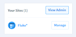
2. Once is your user dashboard, click on View Admin button, on the right column:
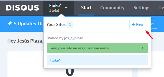
3. On the top menu, hover Sites button, and click on New button:
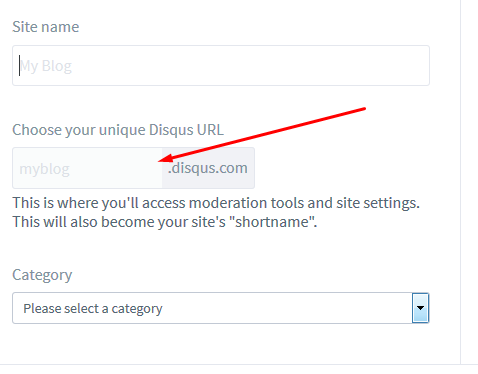
4. On the form, fill up the required fields, and copy the DISQUS url you may setup, as this field is the one you will need to paste on the article pages:
4. Once finished the Site creation process, go to your article html, and in the following sample code, paste the url you setup in the site form.
			(function() {
				var d = document, s = d.createElement('script');
				s.src = 'https://fluketemplate.disqus.com/embed.js';	   //  PASTE HERE YOUR OWN DISQUS-SITE URL, AND KEEP THE /embed.js AT THE END!
				s.setAttribute('data-timestamp', +new Date());
				(d.head || d.body).appendChild(s);
			})();
[TIP] - Note that DISQUS system will only work while testing online, not local!
[TIP] - Inside the sample article HTML, you will find some useful comments to configure variables to have different articles comment feed under the same Disqus Site.
For more info and documentation about Disqus:
https://disqus.com
26. [LATEST POSTS]
This module is placed on sidebar on blog pages. Although it has been made with this in mind, you can use it alternatively on other parts of your site, as a tiny module with links to projects, for example. Just be creative! ;)
27. [PAGINATION]
This module could be useful both for projects pages (if you have many and you need to paginate them) or blog pages. It's basically a CSS module, with no further JS functionality. Just setup your pages links on arrows and numbers.
28. [INSTAGRAM FEED]
Tiny module to display your latest Instagram feed. It's coded for the blog sidebar, but you can use it anywhere on your site. If you want to modify the thumbs size, do it in the css, changing the percent value of the "li" element (default: 23%). Get your instagram username from your instagram account url, and the clientID can be retrieved from the following URL:
https://jelled.com/instagram/lookup-user-id
			$('.instagram-feed ul').instagramLite({
				username: 'furniture.ir',
				clientID: '199554eb34504658a4770d2859b5a583',
				urls: true,
				limit: 7
			});
[TIP] - Set your images number to display on the "limit" parameter on the JS code. For more info and documentation about Instagram Lite plugin:
https://github.com/michael-lynch/instagram-lite
29. [CONTACT FORM]
Although the contact form module is placed on the contact page, you can use it (and customize it) for whatever reasons you may need, a budget proposal form on project page, for example. You will just need to copy the entire div module, and the associated scripts you will see on contact-form.html. Also, don't forget to edit the contact-form.php (check PHP Chapter) to edit your destination email account. [TIP] - Your will need PHP service active and running on your hosting plan in order to use the form. There is no other way to process and send email forms, except using a server-side language, like PHP.
30. [SERVICES LIST]
A simple CSS module to display company services. It includes a title, heading text a 3 columns list of services. You can modify the number and size of columns with the regalur use of the template grid. You can see a sample of this module on modules-samples.html.
SIDE NOTES: USEFUL INFORMATION
Several pages on this template uses the quite useful lightGallery plugin, which allows you to open large big images on a lightbox format (fullscreen over the main content). It also allows to open videos (Vimeo, Youtube, Local-video), as it's shown on provided samples. It's also used to open the legal info on footer on the same lightbox style. The regular usage of the JS is as follows:
			projects.lightGallery({
				mode:'slide',
				speed: 500,
				counter: true,
				loop: true,
				videoMaxWidth: '70%',
				vimeoColor: '00c0ff',
				videoAutoplay: false
			});
For more info about lightGallery plugin and it's full capabilities, check the following url:
https://sachinchoolur.github.io/lightGallery/
JavaScript
This template imports several Javascript files, along its different pages. To make easier the customization, all the scripts are called on all pages. Once you have your on site complete, consider removing the unsued scripts on each page to enhance overall page loading. The global scripts that affects all site (ie. menu management) are placed on js/scripts.js. The scripts affecting only concrete page elements (like the modules functionality), are placed at the end of each page.
- jquery-2.1.4.min.js (jQuery library)
- jquery.browser.min.js (jQuery addon to improve plugin compatibility)
- jquery.easing.1.3.js (Animation classes)
- jquery.form.min.js (Required to process and verification of contact form module)
- jquery.touchSwipe.min.js (Add mobile touch events compatibility)
- imagesloaded.pkgd.min.js (Preload images, required for Isotope plugin)
- jquery.animsition.min.js (Global transition between pages)
- jquery.fitvids.js (Responsive video)
- superfish.js (Menu events and multilevel)
- isotope.pkgd.min.js (Masonry gallery)
- jquery.fs.tipper.min.js (Tooltip plugin)
- lightgallery.min.js (Lightobx plugin)
- lightslider.min.js (Slider and Carousel plugin)
- jquery.collapse.js (Required for accordion module)
- parallax.js (Parallax module effect)
- jquery.easytabs.min.js (Tabs module)
- smoothslides-2.2.1.js (Kenburns styled gallery)
- instagram.lite.min.js (Instagram Feed module)
- pinit.js (Addon to share images on Pinterest)
- gmaps.js & https://maps.google.com/maps/api/js?key=AIzaSyCKvPu0Y_YJpuwTpjc8y8jHHQ5DIEHAFKw (Maps)
- mdetect.js (Mobile and platform detection)
- fastclick.js (Improve usability on mobile devices)
- scripts.js
Except the scripts.js file, the rest of classes copyrights belongs to their respective authors. Please, check each class license and terms conditions on the author websites (check on Sources & Credits for more info)
Also check there the full list of JS used, linking with each project page.
The scripts.js includes some scripts that are shared on all pages of the template. Apart from this global config settings, each html page will include (for easy access) its own javascripts codes, normally associated to modules functionality.
SCRIPTS.JS - Let's explain it a bit...
Note: [editing the jquery plugin code requires some knowledge of javascript and jQuery coding; do not change the .js file unless you know what you are doing. In most of the cases, the html / css accesible data will be enough to customize the template to match your project needs.]
1. GLOBAL VARS
Global variables definition. These variables are available from any HTML of the site. They could be useful if you want to make your own JS scripts to implement new plugins or custom functionality.
			var myWindow = $(window),
			windowWidth = myWindow.width(),
			windowHeight = myWindow.height(),
			htmlbody = $('html, body'),
			device = false,
			tablet = false,
			tabletPortrait = false,
			mobile = false,
			menuOpen = false,
			mapStyles, mapStylesFullscreen, openMenu, closeMenu;
2. DEVICE DETECTION
The following code refers to the detection of Mobiles & Tablets devices. It also includes a detection for all Mac devices (including desktop), adding a .mac class to the body. It could be useful to target directly all macs for some concrete styling.
			// DETECT MOBILES & TABLETS (ANDROID & IOS & WINDOWS8 & BLACKBERRY)
			var android = MobileEsp.DetectAndroid(),
				aphone = MobileEsp.DetectAndroidPhone(),
				atablet = MobileEsp.DetectAndroidTablet(),
				iphone = MobileEsp.DetectIphone(),
				ios = MobileEsp.DetectIos(),
				iphone = MobileEsp.DetectIphone(),
				ipad = MobileEsp.DetectIpad(),
				windows = MobileEsp.DetectWindowsPhone(),
				blackberry = MobileEsp.DetectBlackBerry();

			if (android || ios || windows || blackberry) {
				device = true;
				if(atablet || ipad) tablet = true;
				if(windowWidth < 768) mobile = true;
				if(windowWidth >= 768 && windowWidth < 980) tabletPortrait = true;
			};

			// ADD .mac CLASS TO BODY TO TARGET ALL MAC DEVICES. PLAY WITH IT ON .CSS
			if (navigator.userAgent.indexOf('Mac') > 0) $('body').addClass('mac');
3. PAGE LOADING TRANSITION
This script manages the Animsition plugin, which is used across the full template to manage the page transitions and global preloading. It makes the smooth fading when clicking on links (any link with "pagelink" class added will call the new html in a smooth way). If you want a regular transiton when calling urls, just remove or comment this script. For more info about available transitions and options, check the plugin page: https://git.blivesta.com/animsition/
			wrapper.animsition({
				inClass: "fade-in",
				outClass: "fade-out",
				inDuration: 500,
				outDuration: 500,
				linkElement: '.pagelink',
				loading: true
			});
4. SCROLLING FUNCTIONALITY
This is the script that controls the scroll, mainly for the ONE PAGE SCROLL version of the template, to make sticky the menu on top while scrolling. In this part you will find also the scripts that controls the Back to top arrow button on footer.
			var controlScroll = function() {

			var scrollTop = myWindow.scrollTop();

			// SCROLL TO TOP
			if (scrollTop > 190) {

				//STUFF FOR ONEPAGE SITE (ONLY DESKTOP)
				if (wrapper.hasClass('onepage') && !mobile) {
					header.addClass('sticky');
					$('.logo img').attr('src', 'images/shared/logo-sticky.svg');
				};

			} else {

				//STUFF FOR ONEPAGE SITE (ONLY DESKTOP)
				if (wrapper.hasClass('onepage') && !mobile) {
					header.removeClass('sticky');
					$('.logo img').attr('src', 'images/shared/logo.svg');
				};
			}

		};

		controlScroll();

		// SCROLL UP BUTTON
		scrollUp.click(function () {
			htmlbody.animate({ scrollTop: 0 }, 600);
			return false;
		});

		// WINDOW SCROLL EVENT
		myWindow.scroll(function() {
			controlScroll();
		});
5. Menu
The menu functionality, using the Superfish plugin. It controls the multilevel menu, and also it contains a scripts that dinamically checks the screen width to place the third level right/left side of the parent if there is not enough available space. Note that the plugin has been highly customized for Fluke*, but in case you need to check the original version, here is the plugin author page: https://users.tpg.com.au/j_birch/plugins/superfish/
This part of code also controls the menu for mobile devices, and swipping functions.
			if (!mobile) {
				menu.find('ul').superfish({
					delay: 0,
					animation: {opacity:'show',height:'show'},
					speed: 'fast',
					cssArrows: false,
					disableHI: true,							//HOVERINTENT DISABLED
					onBeforeShow : function (){  				//CHANGE THIRD LEVEL TO LEFT SIDE IF OUT OF WINDOW
						if ($(this).hasClass('third')) {
							var subMenuWidth = $(this).width();
							var parentLi = $(this).parent();
							var parentWidth = parentLi.width();
							var subMenuRight = parentLi.offset().left + parentWidth + subMenuWidth + 60;
							if(subMenuRight > windowWidth){
								$(this).css('left','auto');
								$(this).css('right', parentWidth+'px');
							}
						}
					}
				});
			};

			// MOBILE MENU
			if (mobile) {

				// ACTIVATE SWIPE FOR CLOSE MENU ON MOBILE
				function activateSwipeAndClick() {
					menu.swipe( {
						swipe:function(event, direction, distance, duration, fingerCount, fingerData) {
							if (direction == 'left' && distance > 50) closeMenu(); else menu.animate({'left': 0}, 500, 'easeOutQuart');
						},
						swipeStatus:function(event, phase, direction, distance, duration, fingers) {
							if (direction == 'left') menu.css({'left': -distance});
						},
						threshold:0,
						allowPageScroll:"vertical"
					});
				};

				// OPEN FUNCTION
				openMenu = function() {
					menu.show().animate({'left': '0px'}, 800, 'easeOutQuart');
					activateSwipeAndClick();
					menu.swipe("enable");
					menuOpen = true;
					hamburguer.find($('.fa')).removeClass('fa-navicon').addClass('fa-close');
				};

				// CLOSE FUNCTION
				closeMenu = function() {
					menu.animate({'left': '-100%'}, 500, 'easeInOutQuart', function() {
						$(this).hide();
					});
					menu.swipe("disable");
					menuOpen = false;
					hamburguer.find($('.fa')).removeClass('fa-close').addClass('fa-navicon');
				};

				// OPEN / CLOSE BUTTON
				hamburguer.click(function () {
					if (!menuOpen) openMenu(); else closeMenu();
					return false;
				});

			};
6. LEGAL LIGHTBOX
This function opens the legal info on all pages with the lightGallery plugin (lightbox). Remove it if you want the legal button to open legal page standalone.
			$('#legal').lightGallery({
				thumbnail: false,
				selector: '#legal'
			});
7. SOCIAL NETWORKS TOOLTIP
The tooltip displayed on Social Networks Module. It gets the data-title attribute on each link to retrieve the title displayed.
			var tipperMargin = 15;
			$('.social').each(function() {
				if ($(this).hasClass('bigger')) tipperMargin = 20;
				$(this).find('a').tipper({
					direction: 'top',
					margin: tipperMargin
				});
			});
8. SHARE ON NETWORKS
This is the function that controls the sharing module. It includes Twitter, Facebook, Pinterest and Google+. More nertworks will be included on future versions of Fluke*. If you want to remove a network, it's better if you do it just removing the HTML element, this way you keep the functionality in case you need it in the future.
			$('.share a').click(function (e) {
				e.preventDefault();

				var top = windowHeight / 2 - 235,
					left = windowWidth / 2 - 285,
					url = window.location.href,
					network = $(this).data('title'),
					twitterUser = $(this).data('user'),
					href;

				// DIFFERENT BEHAVIOUR FOR EACH NETWORK
				switch (network) {
					case 'Twitter':
						href = 'https://twitter.com/intent/tweet?url=' + url + '&via=' + twitterUser;
						break;
					case 'Facebook':
						href = 'https://www.facebook.com/sharer.php?u=' + url;
						break;
					case 'Pinterest':
						PinUtils.pinAny();
						break;
					case 'Google+':
						href = 'https://plus.google.com/share?url=' + url;
						break;
				}

				// IF NOT PINTEREST - OPEN WINDOW
				if (network != 'Pinterest') window.open(href, "_blank", "top=" + top + ",left=" + left + ",width=550,height=450");
			});
9. MAP STYLING
Google Maps API allows many styling parameters. To make easier the customization, the global styles for both maps module and fullscreen map module is setup on the global scripts.js file. You can try to make changes by yourself directly on the provided sample code, but it's highly recommended to use the awesome tool you will find on the following page: https://snazzymaps.com. Just copy/paste the code of your customized map replacing the current mapStyles var content. And don't fortget the brackets!
			mapStyles = [{
				stylers: [
					{ hue: "#b1dbd7" },
					{ saturation: -80 }
				]
			}, {
				featureType: "road",
				elementType: "geometry",
				stylers: [
					{ lightness: 100 },
					{ visibility: "simplified" }
				]
			}, {
				featureType: "road",
				elementType: "labels",
				stylers: [
					{ visibility: "off" }
				]
			}];

			// STYLES FOR FULLSCREEN MAP
			mapStylesFullscreen = [{"featureType": ...
CSS
1. FIRST OF ALL: TRY TO USE SASS
Fluke* includes the SASS version of the CSS file. If you have never heard about SASS, we highly recommend you to take a look and give it a try. Even if you are not a developer, you will find it quite useful and will turn into a must in any of your future web projects. SASS is basically a pre-processor for CSS, allowing some tools like nesting, variables, custom mixins -functions-, that will make the styling task much more easier and straight forward. You don't need to use SASS in order to edit the css of Fluke*, but it will make your life easier doing so. ;)
For more info about SASS, check the following link: https://sass-lang.com/
No matter if you use SASS to edit the CSS, or you edit the CSS files directly, the first thing you may consider is to choose between Serfi or Sans-Serif version of Fluke*. Both versions (Light and Dark) contains both font styles. You can easily change from Serif to Sans-serif version just modifying the main CSS file (style.css for Serif default version, styles-sans.css for Sans-Serif). Just place one of the following (not both!):
		// THIS IS THE SANS SERIF VERSION


		// THIS IS THE SERIF VERSION (DEFAULT)
The CSS is well organized and each module entry is properly named. The order remains the overall nomenglature on the html structure. The blocks inside the styles.css file are:
- Imports
- Global
- Layout
- Content > globals
- Header
- Page exceptions
- Modules
- Footer
- Platforms exceptions
2. HOW TO REPLACE THE MAIN COLOR
If you use SASS, you can take advantage of its variables definition. The following color vars affects the full template:
		$accent: #00c0ff;
		$main-grey: #999;
		$dark-grey: #202020;
		$light-grey: #d6d6d6;
		$grey: #6F7072;
If you don't use SASS and are editing the CSS directly, make a global search/replace to the colors defined in the previous vars. So, for instance, if you want to change the accent color on the whole template, search/replace the string "#00c0ff" (without quotes) with your desired hexadecimal color.
3. HOW TO CHANGE THE FONT SCHEME
If you want to change the whole font scheme (and not only switch between serif and sans-serif version), you will need to do it changing the import lines at the begining of the CSS, which links to Google Fonts API:
		@import url(https://fonts.googleapis.com/css?family=Droid+Serif:400,400italic,700,700italic);
		@import url(https://fonts.googleapis.com/css?family=Source+Sans+Pro:300,300italic,600,600italic);
To choose any other font, check the Google Fonts repository: https://www.google.com/fonts
4. HOW TO CHANGE MODULES STYLES
The CSS is properly commented (it's easier if you use SASS, as its nested structure makes pretty fast to locate the different sections), so find the module you want to change (by its name) and change the CSS entries independently. Apart from the global stuff, each module is styled standlone.
5. HOW TO CONTROL THE RESPONSIVE GRID
Fluke* uses a flexible responsive GRID, based on Unsematnic Framework. Just consider you have full control of columns for all platforms, desktop, tablet and devices, with the possiblity to have different layouts (or even contents!) on the different devices. There are also 2 breakpoints for desktop screens, which fluid smoothly from 960 to 1200 grid systems. The best way to get used to it is following the provided samples. The best way to get used to it is by following the provided samples. Try to learn from the default layout, and then be creative! ;)
For more info and fonts check the following URL:
https://unsemantic.com/
6. RESPONSIVE BREAKPOINTS
All the responsive CSS (mobiles and tablets devices) are located in responsive.css file. The breakpoints for Fluke* are the following:
- 981px TO 1280px - SMALL TO MEDIUM SCREENS
- 768px TO 980px - PORTRAIT TABLET TO LANDSCAPE AND DESKTOP
- 0px TO 767px - LANDSCAPE MOBILES AND DOWN
7. HOW TO USE THE FONTAWESOME ICONS
You can place Font Awesome icons just about anywhere using the CSS Prefix fa and the icon's name. Font Awesome is designed to be used with inline elements (all samples are included using < i > tag for brevity, but using a < span > is also semantically correct).
To increase icon sizes relative to their container, use the fa-lg (33% increase), fa-2x, fa-3x, fa-4x, or fa-5x classes.
		 fa-camera-retro

		 fa-lg
		 fa-2x
		 fa-3x
		 fa-4x
		 fa-5x
For more info and included icons, check FontAwesome site: https://fortawesome.github.io/Font-Awesome/
8. EXTERNAL CSS
Some modules allows external CSS editing. Otherwise, the styles are all inside main CSS file. The css files for each one are the listed below:
css/lightgallery.css							// Lightbox gallery module
css/lightslider.css								// Sliders and Carousels module
css/tipper.css									// Tooltip module
PHP
To use the available Contact form that is displayed inside "Contact-form" Page, you will need PHP active and running on your server. You can easily edit it with any text editor, the whole file is properly labeled and commented. Refer to the commented lines to configure your destination email account (it should be from the same domain where the site is hosted, but it depends on your hosting provider), the email subject and some other labels. Don't touch variables names or other important stuff, unless you know what you are doing, as it could cause the form process malfunction.
					//////////////////  EDIT THESE VALUES ////////////////////

					//DESTINATION EMAIL (THE EMAIL WHERE YOU WANT TO RECEIVE THE FORM)
					$destination="name@anydomain.com";

					//SENDER EMAIL
					//FOR SECURITY REASONS, IT'S BETTER IF YOU SEND THE EMAIL
					//FROM AN ACCOUNT FROM THE SAME DOMAIN WHERE THE SITE IS HOSTED
					$mailFrom="name@yourdomain.com";

					//SET EMAIL SUBJECT
					$subject="New message from your company site form";

					//////////////////  STOP EDITING ////////////////////
Also you can edit the error messages that the user will receive when the form is not filled up properly, or some server error occurs:
				if ( mail($destination,$subject,$mailMessage,$mailHeader) ) {
								echo 'Form succesfully sent!';
							}
							else echo 'Server error: please, try again.'; //SERVER ERROR

						}
						else echo 'Error: you must agree with privacy terms'; //LEGAL CHECKBOX ERROR

					}
					else echo 'Error: non valid Email';	//EMAIL VALIDATION ERROR

				}
				else echo 'Error: missing fields'; //VARS ERROR
PSD Files
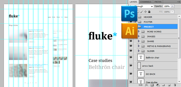
This file includes 12 psds with the different layouts of Fluke*. All are full layered and can be easily edited with Photoshop (min. CS version). All PSDs includes the grid column layout system.
The PSD files are located inside /02_Psds folder in the original source pack. Don't forget to install the required fonts (available on Google Fonts repository, before editing the PSDs. https://www.google.com/fonts
Useful Links
If you need some basic help on Javascript, or the integrated jQuery plugins, please, check the urls provided on the HTML STRUCTURE AND CUSTOM MODULES section. In any case, in the following websites you will find useful information and tools to make easier your customization:
-
jQuery Tutorials
- https://www.w3schools.com/js/
- https://learn.jquery.com/
- https://docs.jquery.com/Tutorials:How_jQuery_Works
- https://www.w3schools.com/css/
- https://www.csstutorial.net
- https://www.htmldog.com/guides/css/beginner/
- Sublime text - Free Code Editor (Highly recommended!!)
- Notepad++ - Free source code editor
- Online simple image resizer
- Online Photo editor
CSS Tutorials
Useful tools
Sources and Credits
The file uses some open source files, here are the project / authors urls. Please refer to them in case you
have doubts regarding licenses or copyrights limitations while using this plugin.
- https://www.jquery.com
- https://gsgd.co.uk/sandbox/jquery/easing
- https://sachinchoolur.github.io/lightslider/
- https://sachinchoolur.github.io/lightGallery/
- https://kthornbloom.github.io/Smoothslides/
- https://isotope.metafizzy.co/
- https://users.tpg.com.au/j_birch/plugins/superfish/
- https://classic.formstone.it/components/tipper
- https://users.tpg.com.au/j_birch/plugins/superfish
- https://webcloud.se/jQuery-Collapse
- https://os.alfajango.com/easytabs/
- https://fitvidsjs.com/
- https://github.com/michael-lynch/instagram-lite
- https://hpneo.github.io/gmaps/
- https://blivesta.github.io/animsition
- https://blog.mobileesp.com/ - Mdetect
- https://github.com/imakewebthings/jquery-waypoints/
- https://github.com/mattbryson/TouchSwipe-Jquery-Plugin
- Heather Corey - jQuery Simple Parallax Plugin
- https://unsemantic.com/
The fonts used in these previews (available for free download) are: Just remember that you don't need to install these fonts in order to edit the html template, just if you want to make edits or changes over the provided Photoshop files.
About the images
The online samples images belongs to their respective owners and are only used for demo purpouses.Some images (Creative Commons licensed) from these great Flickr authors have been used:
ARCHDIS, Peter Hess & ASSOC. FABRICATION
Also, the blog article images belongs to this great free stock site: https://unsplash.com/
None of these images are included in this source pack.
Once again, thank you so much for purchasing this template.
If you have a more general question relating to this file, dont' hesitate to contact me through my profile form.
